Musings

A smattering of my thoughts

Yoyo CRM: Case Study

Introduction

My first introduction to the startup world was through a 30 second pitch at Creative Mornings Minneapolis. One of the Yoyo CRM co-founders talked about an app he was working on and how they were looking for an icon designer to join their team. We chatted briefly afterwards and planned a meeting to discuss my involvement and see what ideas I had to offer. The team asked me to redo their “Client Overview Page” before we would meet up and I happily obliged.

Empathize

My first action was to empathize with the user. I had purposely avoided even opening the app until I was ready to take notes, documenting my initial thoughts and frustrations. From the brief pitch and conversation I knew how the app should function.

I approached testing it from the perspective of the user, a hairstylist that was seeking to scrap paper client management for a digital variation. I walked through the various functions of the app, documenting my pain points as both a designer (visually) and a user (experimentally). I set up an account and bumbled through setting up a few “customers” in the app. After my initial analysis, I went through the app a second time testing links, observing animations, and looking for general bugs

Brainstorm

The main concept the co-founders conveyed was their vision for a sleek and modern app. This app should accomplish its goal both in form (design) and function (usability). A stylist should to be able to take a quick glance (10-30 seconds) at their phone and be ready and informed for their next appointment.

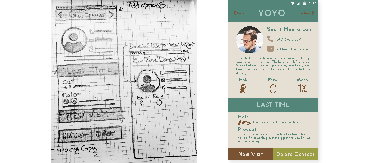
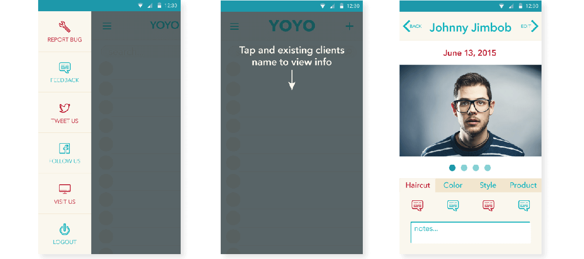
The first pain point I noticed was the large amount of scrolling needed to view basic client info: phone number, email, hair type, hair color formula, etc. The revised concept I presented to the team condensed all of this information into one non-scrolling “dashboard” screen. They liked the concept and brought me on as a UX and Visual Designer.

Insights

At my first team meeting we walked through the existing app and shared pain points we had individually documented, along with insights that had been gathered from user testing and Q&A sessions. We debated flow, function, and design possibilities which left us with some great ideas to pursue for our next meeting. Most of the insights pointed to frustration that arose from inconsistent UI and a confusing user flow.
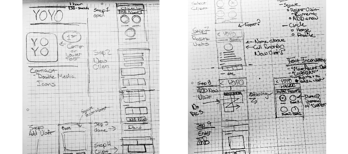
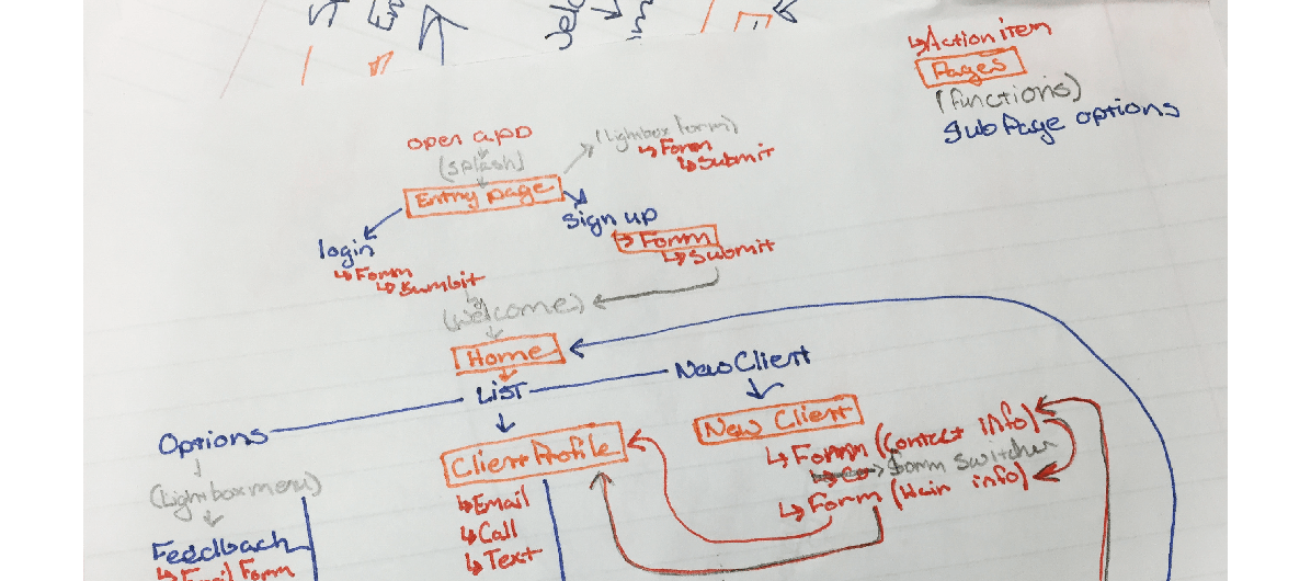
Prototyping

As a part of that initial meeting, we started prototyping with whiteboards and sticky notes. We implemented our results into a quick and dirty mockup in Balsamiq that I later refined and implemented into InVision. Using a combination of InVision and interactive PDFs we had users test these changes. From the updates we implemented we saw less confusion and greater satisfaction with the overall process.

While I was brought in as UX/UI designer most of the user testing and interviews were conducted by others team members with backgrounds in customer insights. This was a little difficult at first but in the long run allowed me to gain insights from questions that I would not have thought to ask as a digital native and designer.
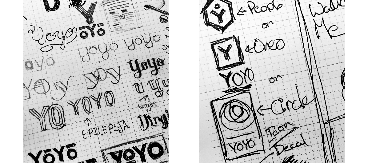
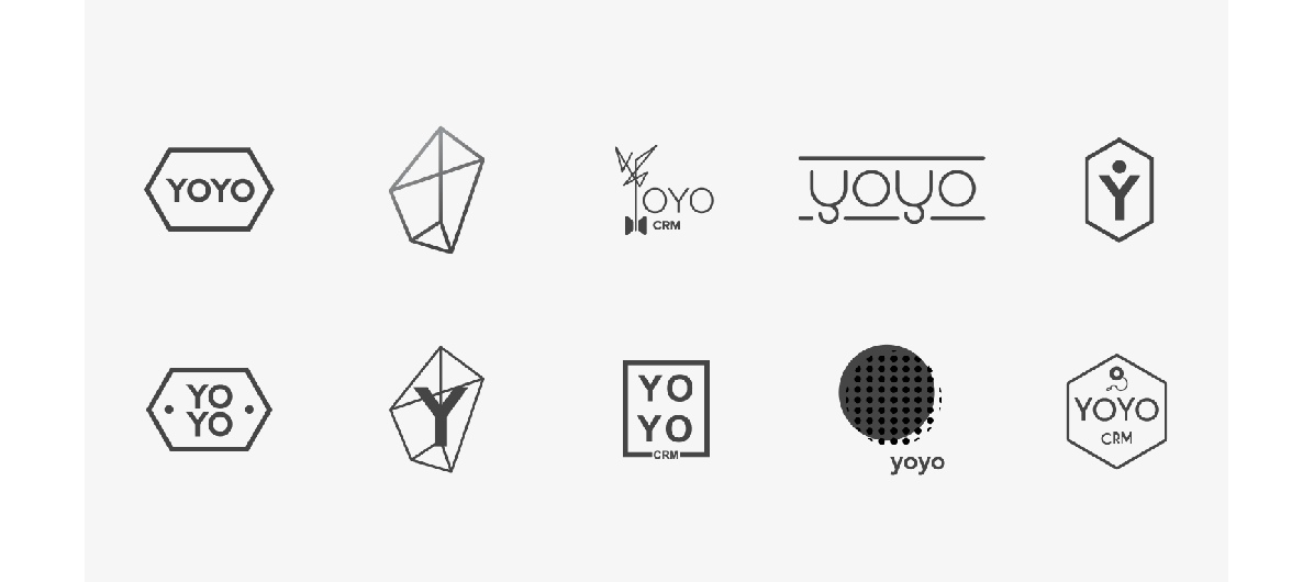
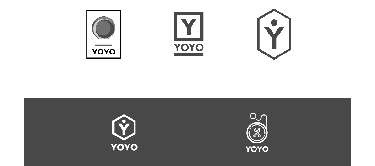
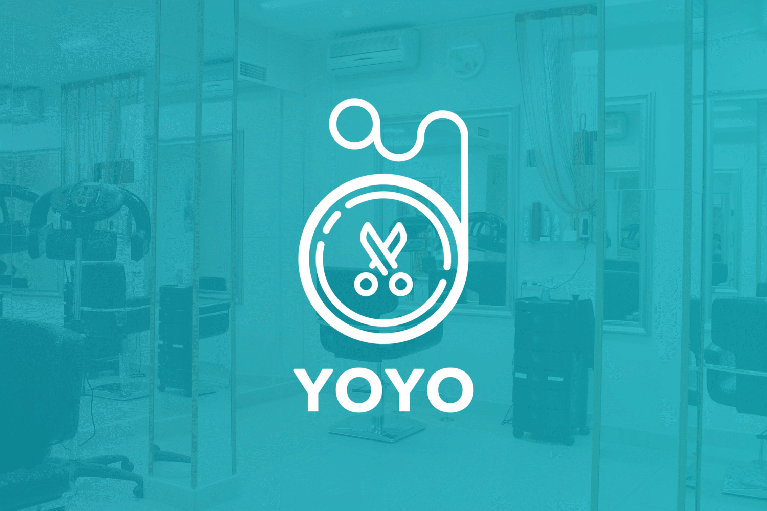
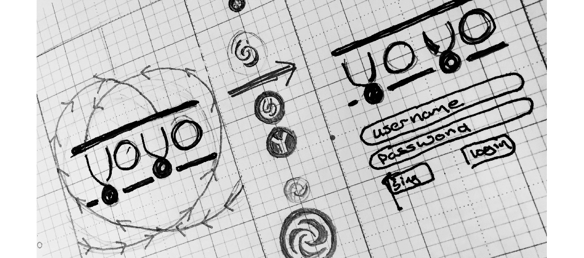
Rebrand

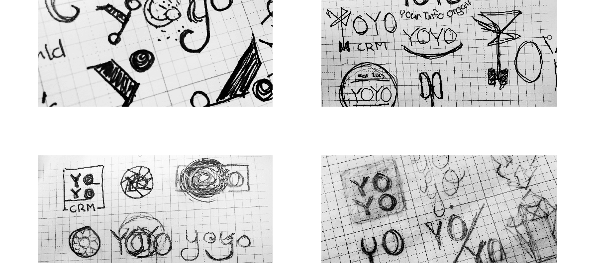
Synonymously with restructuring and prototyping the app we started to rebrand the company. Due to some potential issues with using the existing brand we needed to start right away. We started the rebrand process with a discussion on how the current branding was successful and failing the existing vision for the app. I used the feedback as a springboard for color pallets and logo concepts. I had bi-monthly calls with the brand manager until we had crafted something that we excitedly shared with the rest of the team.

Implementation

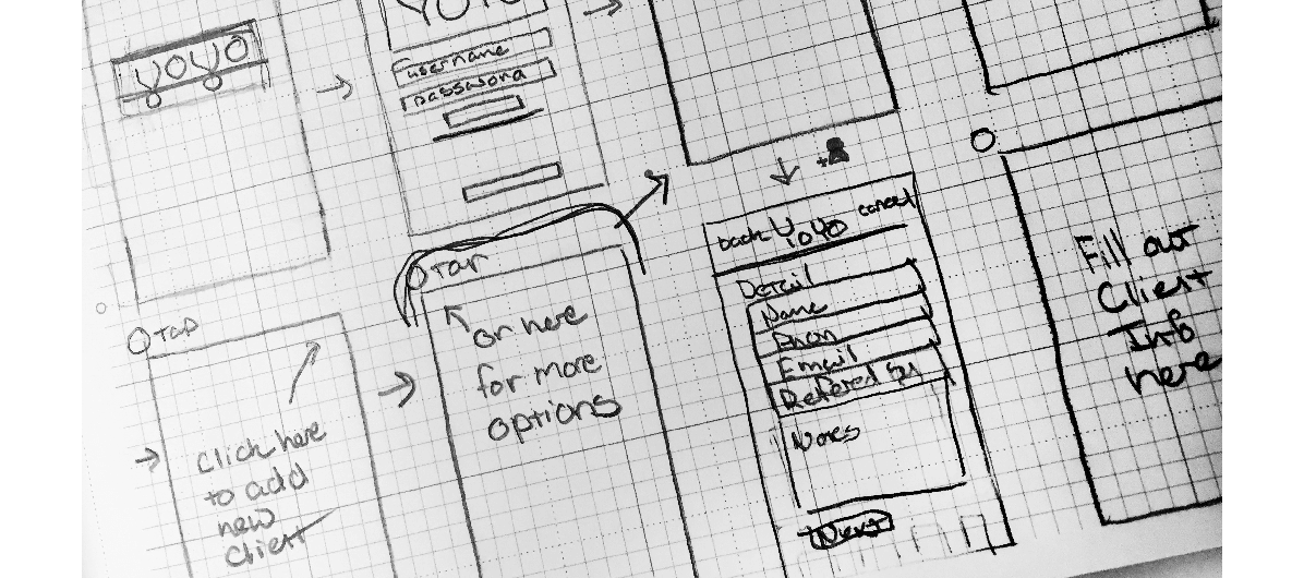
Using the results of our insights, prototyping and the rebrand, I mocked up designs for the primary pages of the app to be handed off to the developer. My first round of designs had been tooled to work with our initial developer’s skill set, but when a new developer joined the team we had to drastically adjust the designs. Our beta app launch incorporated our new app branding along with a redesigned “dashboard” and profile system.

Take Aways

It was an awesome experience to work with people that had such a diverse set of backgrounds. I learned a ton from being a part of this team. It was also my first opportunity to work with a non-design centric art director, while initially frustrating we persevered though the initial challenge to create an awesome brand. This was also my first time working in a situation where I was not doing my own development. It was a little odd at first but I adapted quickly!

Yoyo CRM introduced me to the exciting worlds of Slack, Trello, Sketch, and InVision. While it was difficult to learn so many new programs all at once, it has helped me to quickly adapt to new programs and workflows as they come my way.

Closing

A couple of months ago we decided as a team that Yoyo CRM would be shutting down. With all of our team members having full-time jobs and lives in addition to Yoyo we were unable to give the time needed to keep the project going. While I am sad that this needed to happen, I am glad for my experience with Yoyo CRM and the people I met while working on this project. It has opened my eyes to the awesome world of startups, and has led to my ongoing involvement with 1 Million Cups and participation in Startup Weekends. I will definitely miss working on Yoyo, but I’m excited to see what comes next!

Stay splendid,
Matt

The Art and Science of Color

An essential element of any design is color. Color is a science, yet it’s also taught as a theory. Every color carries meaning and deep associations. It’s true for brands and their designs too. Doritos and Coca-Cola have both experimented with changing the colors of their packaging and received negative results. Consumers said the chips and soda actually tasted different. Did these companies change anything about how they made their products? No. It was the change of color that changed consumers’ minds.

A few questions I often hear about color: “Why is color important?” “Can’t we just replace the green with orange?” “Can you make it Coca-Cola red?” But color choice is so much more than simply swapping one color with another. Color choices should be intentional and made carefully.

In western culture, white is the color of purity and weddings, but in eastern cultures, it’s associated with death and funerals. Colors can carry a lot of meaning. Certain ones may represent different things to different people, while the meanings of others are more universal. When you see blue, what do you think about? The sky? Water? Freedom? When we see colors, we make subconscious associations with them. Bright red might make someone instinctively think of danger or that something is wrong, while natural brown and green tones relax the viewer.

Another great example of how much weight colors can carry appears in the movie “The Devil Wears Prada.” Miranda, a fashion magazine editor, explains to her intern how much time, consideration, and money went into the color of her cerulean sweater.

Color can say a lot about your company or brand without using any words. Many companies will use this to their advantage, and some will even trademark a color. Think of a few company/color combinations. The Home Depot has a trademark on its specific shade of orange. Before you even see the name, you associate the color orange with construction and the company. Cadbury’s signature purple was also not a random selection. Purple was used for centuries by royalty and those who could afford the finer things in life. There is no color better suited to represent a luxurious chocolate than than a royal purple.

Ask yourself: Would the Starbucks logo be the same with a different shade of green? Would McDonald’s be as recognizable without the yellow arches? Would a Tiffany’s box be as delightful if it weren’t blue?

When selecting colors, spend time thinking about what the colors say without words. The right choice will allow your colors to speak for themselves.

Stay splendid,
Matt

Sundog Diaries: Part 3, Friday Farewell

I had a great summer in Fargo, ND of all places. I had initially came to Fargo for the sole purpose of being a design intern at Sundog Interactive. Little did I know I would be doing way more than just design. I found friends, fun, and great coffee!

While I was a design intern I also had the opportunity to step up and do some development work; it was definitely a baptism by flaming code.
I can now confidently say I know what jQuery is, and that it is much easier that javascript… it’s fun!… once the bugs have been worked out. A big shout out to the awesome development team that was able to answer many of my questions. I learned a lot from Corey T. and Sunsanna O. when they had the chance to help me pare down and clean up my code.

It was a great experience to be able to watch Sundog’s design pros hard at work and play (we rocked the kickball field)! They taught me everything from new photoshop functions to solving some in-depth design quandaries that I would have from time to time. I also loved how Sundog paired each intern with an advisor/mentor during our time there. Kaite K. was my design mentor and we had a chance each week to sit down to chat about what I was doing both bad and good and how I could improve. It was amazingly helpful to have this weekly feedback on my performance and how our project was proceeding. The designers were an awesome group that really made me feel a part of the creative team as a whole. Even if they made me eat sushi ;p

Another unique part of my internship at Sundog was the intern team. It was an amazing experience to work have our own space – the Dog Park – to have meetings or just to work on our main project. It was definitely a good learning experience to work with a project manager intern and a creative writing/social media intern! I can say with confidence we all learned a TON from each other over the internship.

Coming away from my internship at Sundog was bittersweet. They had prepared me for my next internship adventure in the corn fields of Nebraska. I was excited for a new adventure but sad to leave all my friends in the plains of North Dakota.

Stay splendid,
Matt

Sundog Diaries: Part 2, Moody Music

Emotional. Intriguing. Relaxing.

These are a few words that came to mind as I was listening to violinist, Leoncarlo. The interns had the pleasure of hearing him perform at last week’s 1 Million Cups Fargo’s Random Acts of Art. As a musician myself, it is easy to see how he influences his audience with sound. It reminds me just how powerful sound and music really is. It affects emotions and will change the entire mood of a room.

Music can pull us to other times and places, or affect how we perceive a message. A major example of this is seen in horror and thriller movies. In the seconds leading up to a “scary” event, the tone and key of the music will shift dramatically, telling us that something scary is about to happen. If you want to try a fun experiment, watch a scary movie muted with subtitles, or without the music. While you might be startled a couple times, the strength of the scare is gone.


Another way that we can see the power of music is in commercials, especially for cars. Car advertisers will play a classical sonata or light rock to portray the elegance or refinement of a luxury vehicle. Country is reserved for hard working trucks, while indie music is often heard in commercials for vehicles designed for adventure.

Currently, my go to for coding music is the electro swing artist Parov Stelar. The changes in tone, beat, and vocals keep my mind engaged and focused on the intern’s project. When doing research I have a go to playlist of soundtracks by GuiguiF, but if I’m designing I prefer this list of laid back variety. Being perceptive about how music can affect perception or music acuity is a great skill to acquire. Just remember to take a mental break – feel the music, and yield to its emotion.

P.S. As Kelli mentioned in her last post we have been super busy lately, but I needed a little break from design and development. The last few weeks have been great. I have learned a ton about code, namely JavaScript and PHP. Being my own developer on our project, has increased my empathy for developers when they are presented with difficult designs – you guys rock!

Stay splendid,
Matt

Sundog Diaries: Part 1, Meditation with Balloons!

Back on our second day at Sundog, Emily and I went to Sundog’s Be + present morning session, where we learned about mindful meditation. Being completely new to meditation, I was unsure of what to expect.

It was interesting in the most non-Minnesotan way possible. The session was relaxing and refreshing, and I came away feeling calm and recharged for the rest of my day. It was a great interruption to a hectic morning, and it gave me a chance to stop and reflect in quietness.

One exercise we practiced to keep our mind clear was to capture stray thoughts and turn them into balloons. This lets your mind focus and lets the distracting thoughts float away. I decided to start applying this principle to other areas of my life, especially when I get stressed or things spin out of control. So I started to let distractions float away.

As an extremely determined and focused individual, I easily develop tunnel vision on everything–from projects to events. I fixate on getting to the finish line without taking time to enjoy the journey. I have come to realize that I need to slow down and enjoy the journey and the process. I should take the time to process the steps and events in my life, rather than jumping to the next part. I need to focus on what needs doing now, rather than that elusive goal that I should “baloon” for the time being.

I recommend that you you take a little time to sit and process your day. Examine what was good and bad. Process the lessons you learned, then let them “balloon” away. You can always learn from your success and failure, but you can’t always change them. So examine then move on!

Stay splendid,
Matt

Angel Bomb Letterpress

Tonight I got the chance to tour Angel Bomb with the seniors design students at UNWSP. Angel Bomb is a letterpress and design studio in Northeast Minneapolis. The studio is owned Todd Thyberg. He was kind enough to answer our questions about letterpress, working with clients, and running a studio. Todd started by giving us a brief historical overview of print in relation to letterpress.

  • Our letterpress history lesson started with a discussion about Gutenberg’s moveable type printing press. Not only was his invention revolutionary for the printing industry, but it also saved time and money. Moveable type’s ease of use and relative inexpensiveness lead to more published books and printed materials that the literate masses would then consume.
  • Jump ahead about 400 years to the 1950-60s, the home to the next major change in printing. This new method was called offset printing, and uses a lithographic style of printing but on a large scale. Originally lithography required large slabs of sandstone and oil based artwork negative to then be inscribed on the stone. The modern day equivalent requires aluminum plates; these when inked transfer the image to rubber sheet which then apply the ink to the paper. Because the aluminum plate doesn’t touch the paper surface it is considered an offset method.
  • The next change in printing was the transition to digital. This is probably the most familiar method because both the inkjet and laser printers are considered digital printing methods. Today digital printing is mainly used in offices and homes, but it is also used for shorter print runs typically up to 2-3 thousand copies.
  • Recently there has been a resurgence in letterpress due to the craft nature of the process. In reacting to the temporary and fleeting nature of digital age, letterpress presents a lasting artifact that represents the blood, sweat, and tears that went into the project. An added benefit of letterpress is that the type or imagery is press into the paper leaving a lovely deboss. This process is also more open to a wider variety papers that are typically problematic to other printing methods. One modern advancement to letterpress was the invention of polymer plates. These plates allow for a wider variety of type and illustration, that would have cost a fortune historically.

Todd went on to talk about how he works with clients and how best to design for letterpress. The biggest points he made about designing for letterpress were:

  • Colors: With newer methods multiple colors prints are easy to produce. Letterpress printing requires a new ink and plate for every color that is used. The more colors involved in a project the higher the cost will be. Another consideration to make when dealing with letterpress is the fact that lighter colors, such as yellow, may appear transparent. To accommodate for this the printer might need double or triple printed to get the desire vibrance this might also increase the cost of your project.
  • Type: When printing with letterpress small details and type can become lost or unreadable. You should always try to keep the type and visual large. If you are questioning your design ask your printer, they will know what their equipment can tolerate.
  • Trapping: When designing a project that will be printed multiple time you need to be aware that the color might not line up as perfectly as it did on the computer. Some designers make allowance for this by adding outlines to cover the areas in question, while others will simply attribute it to the beauty of the craft. Designing with trapping in mind accounts for the margin of error that results when you have to print a piece multiple times.

It was great to brush up on my history of print, and see to some of the awesome work that Angel Bomb has been producing. I look forward to seeing more great work from their studio in the future!

Stay splendid!
Matt